Case Study
This Revelo project focused on building a sharper identity system that could look confident, deliberate, and ready for rollout. The aim was a brand presentation that felt cleaner, more recognisable, and easier to apply consistently across the first wave of touchpoints.
Project focus
Create a stronger identity system that feels clear, modern, and rollout-ready.
Strategic priorities
- Clarity in first impressions
- Recognisable visual direction
- Consistency across touchpoints
Visible outputs
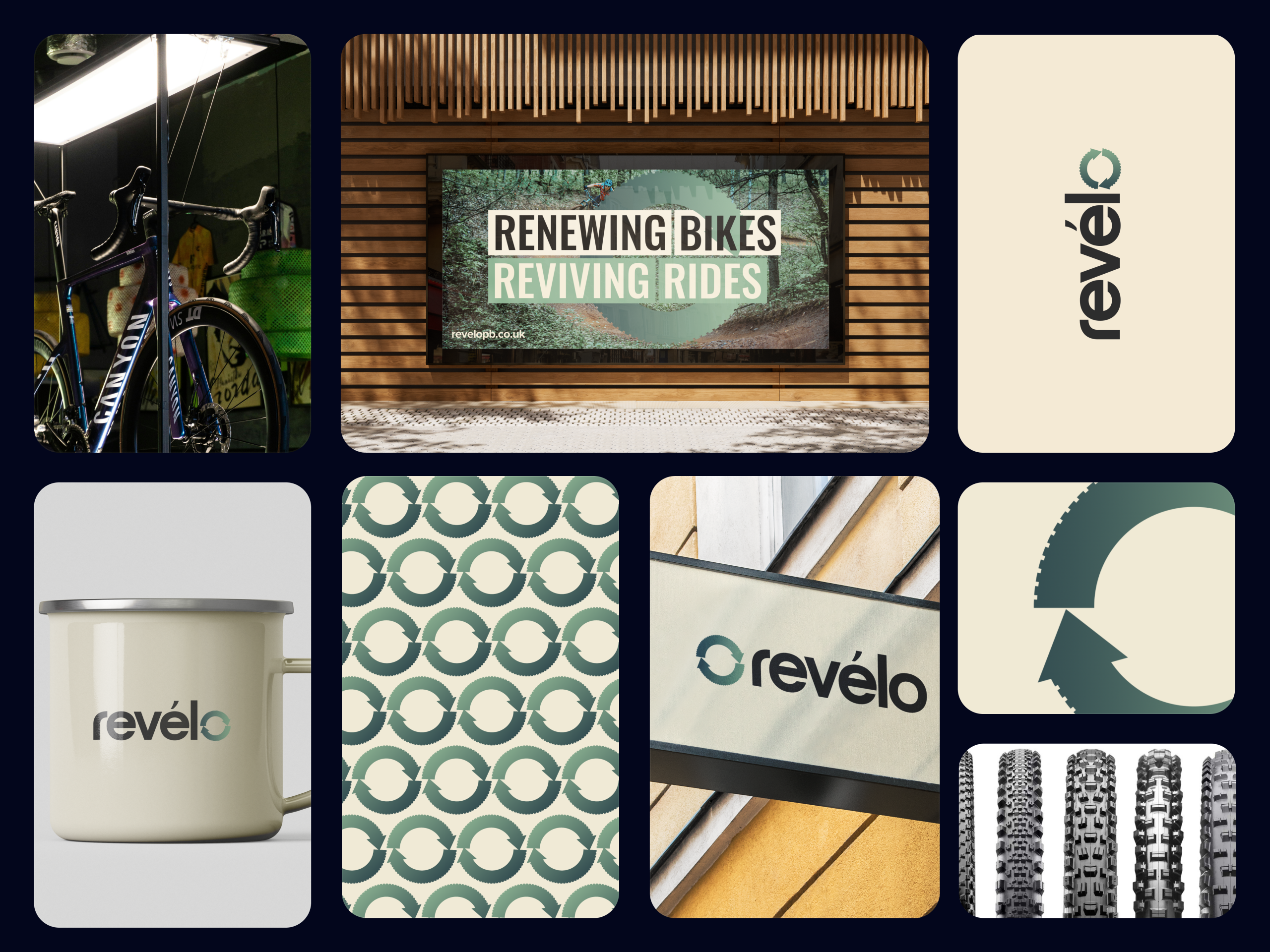
- Primary logo direction
- Supporting identity assets
- Presentation-ready brand visuals
What needed to change
Growing businesses often need their brand to do more than look polished in isolation. It has to communicate confidence quickly, stay coherent across different contexts, and support the business as it becomes more visible.
For Revelo, the project direction centred on building a brand presentation that looked intentional from the first glance and could support consistent rollout beyond a single logo file.
How the identity was shaped
The work starts with the signal the brand needs to send, then translates that into visual decisions. That means aligning the identity around clarity, recognisability, and a stronger sense of structure before expanding into supporting assets.
- A more disciplined logo and brand mark direction
- Visual consistency that feels easier to carry forward
- A system designed to feel considered rather than improvised
What the finished work supports
The end result is an identity direction that makes the business feel more established and easier to recognise. Instead of relying on disconnected visuals, the project moves toward a cohesive system that is simpler to apply across launch and presentation materials.